Logotypes now and in the past
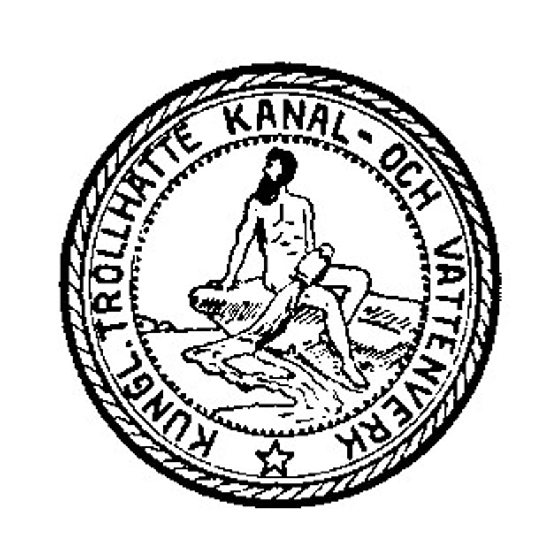
1909
In 1908, the Swedish parliament decided to set up an administrative board to manage the state’s fall rights and the nation’s canals. As a result, Vattenfall (the board) began work on 1 January 1909 in Trollhättan. The activities of the Trollhätte Canal and Waterworks Administration were also taken over by Vattenfall.
This was the emblem of the Trollhätte Canal and Waterworks Administration from 1905 to 1908, before it became part of Vattenfall on 1 January 1909.
1920
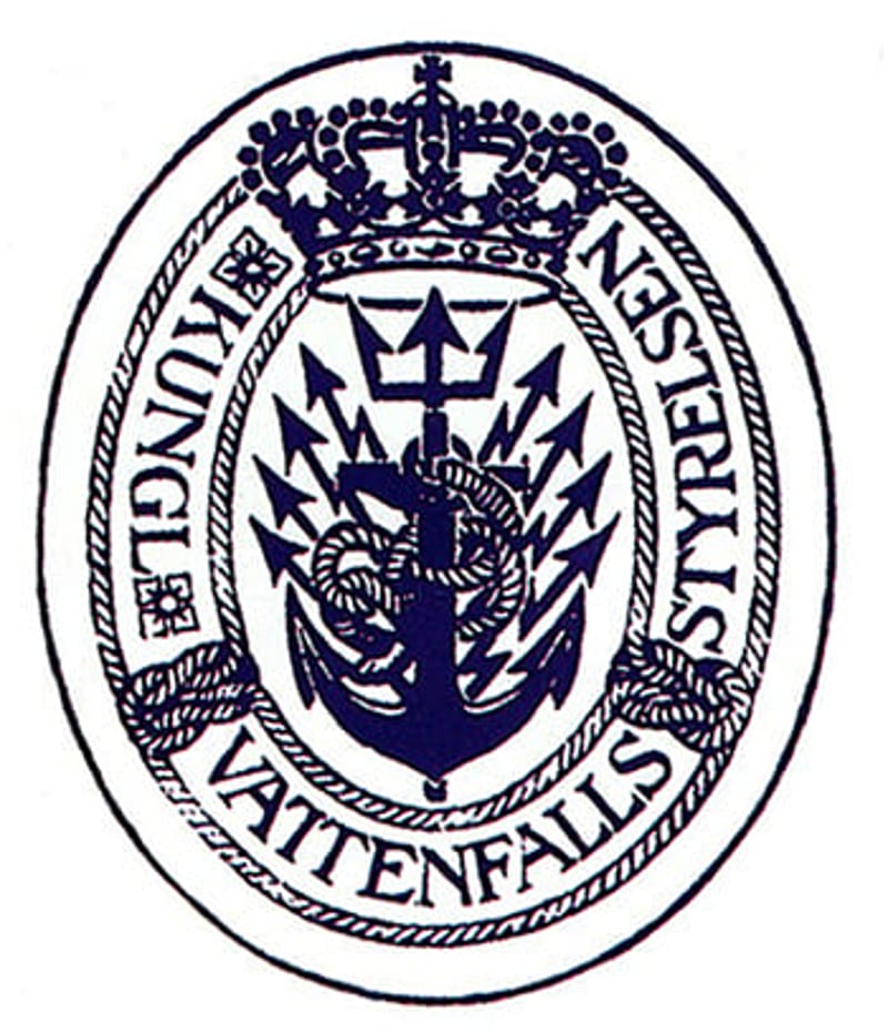
Vattenfall was responsible for the Canal Administration in Trollhättan, which comprised a canal director, traffic control staff and 38 canal pilots. Initially, therefore, Vattenfall was largely a canal administration board. Vattenfall's first emblem, adopted in 1920, clearly shows Vattenfall’s origins in the Trollhätte Canal and Waterworks Administration.
At the centre of the emblem is an anchor, which leads into a trident topped by the Swedish crown. A hawser is wound around the anchor, and the emblem is framed by a hawser design. Electrical rays alongside the anchor symbolise the power operations. Vattenfall’s first architect, Erik Josephson, designed the emblem.
1936
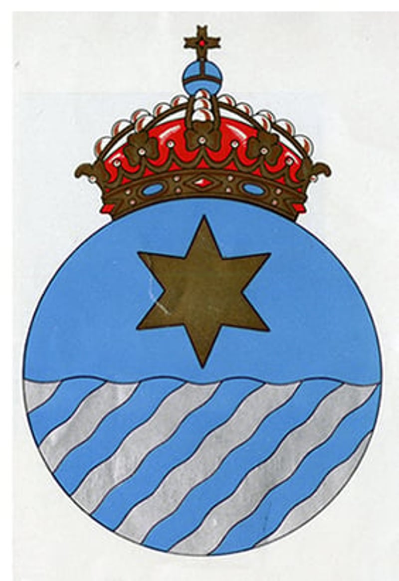
Vattenfall introduced this emblem in 1936. The Director General at the time, Gösta Malm (1928–1938), commissioned the architect Erik Hahr to design it.
The emblem was meant to symbolise both the canal operations and the power operations. As both were based on the same raw material, water, Hahr incorporated 'waves' into the lower half of the emblem. The star soaring above the waves represents the engineering arts.
1964

This logotype appeared in a customer magazine in 1964. It gradually gained ground and became Vattenfall’s official logotype in 1982.
1992
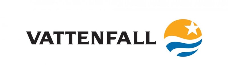
In 1992, Vattenfall was converted into a limited liability company (Vattenfall AB). Vattenfall was now able to compete with other players on the energy market on the same terms. This in turn offered new opportunities but also entailed greater demands.
Vattenfall had to reinforce and defend its position as one of the foremost energy groups in the Nordic countries. At this point, the logotype was released and implemented with the intention of expressing the strategic changes taking place, and of preparing Vattenfall to take a new position on the energy market. The symbol was composed of strong, powerful elements: the sun, water and stars — elements that are all important for human survival. The chosen elements also gave the symbol its colours.
2017

The present logo expresses both heritage and future orientation. It builds on the elements of the 1992 logo: sun and water, and in its solid form also our Swedish origins.
The logotype symbolises the holistic responsibility and leadership that Vattenfall takes towards a fossil free future, visually enhancing a global aspiration to be a role model for sustainable change. It represents Vattenfall’s broader thinking and ability to act on a larger scale, and to enable the fossil freedom that drives society forward.
The horizon in the logotype stands for balance and harmony. Balance is key for a sustainable future. Equally, it is an expression of partnership – where two sides meet to create something larger and more balanced.


